Project:
Our Capabilities
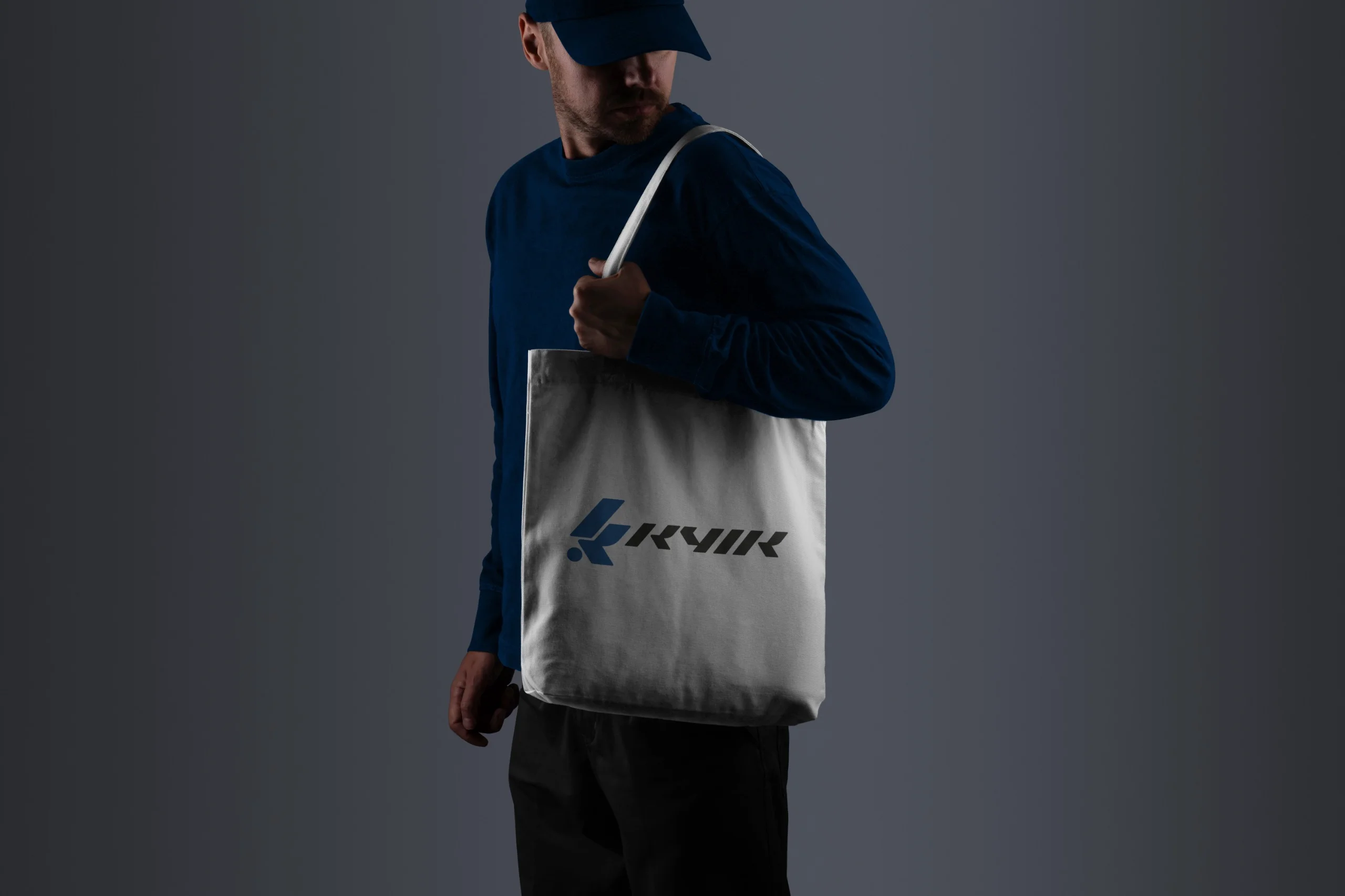
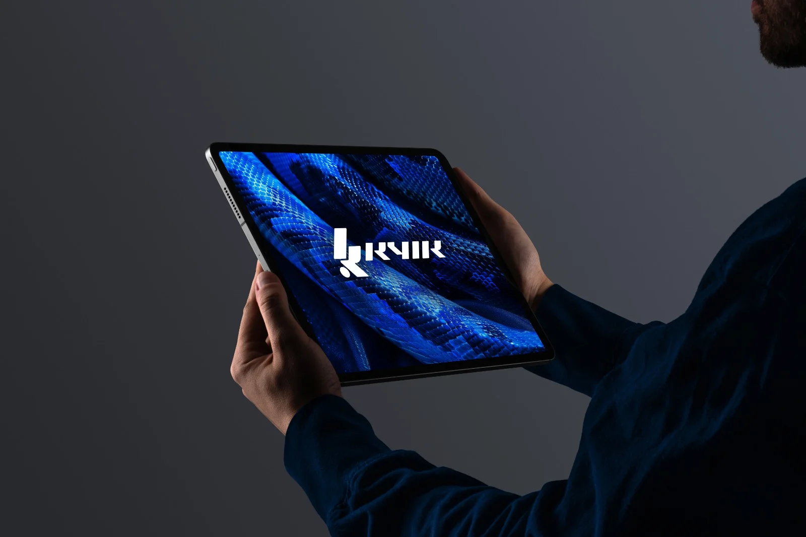
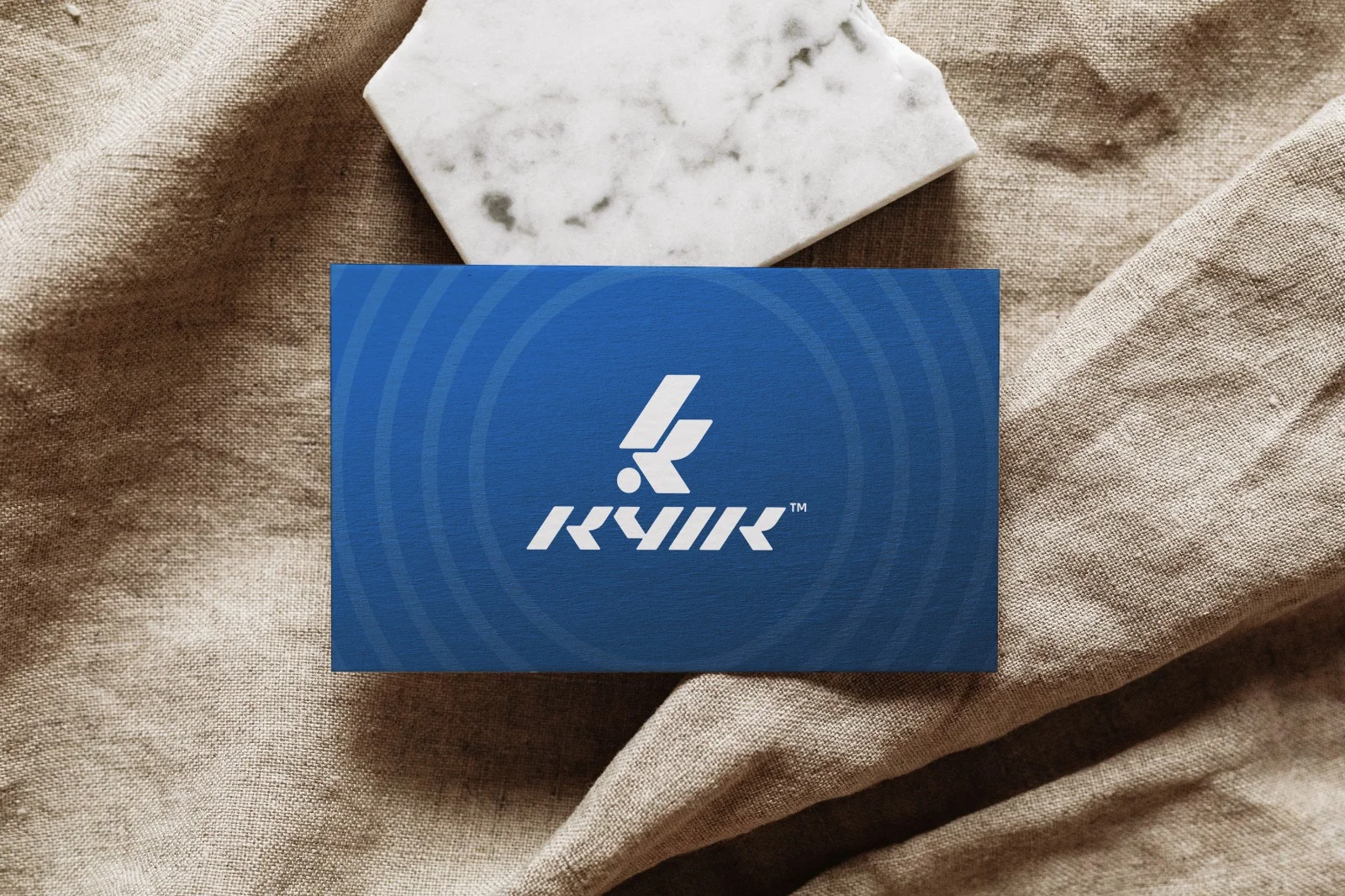
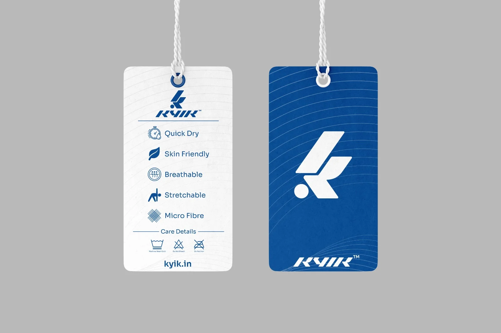
Kyik
Logo & Brand Identity / Tone of voice /
Brand positioning / Packaging Design
This is what happens when a visionary founder brings the spark, and we bring it to life — one pixel at a time.
~Sanskar, Creative Lead On KYIK INDIA
"We love your work — and honestly, I don’t think there’s anyone else out here doing what you’re doing. The kind of design and marketing quality you deliver, especially at this price point, is unmatched. For a startup like ours to get branding that feels like it belongs to a major, established brand — that’s rare. You’re not just designing, you’re empowering small businesses to dream big and show up like leaders."
~ Ceermoye, Founder - KYIK INDIA
"Something Quirky & Fast"
The Story Behind Kyik
When Ceermoye, the founder of Kyik, came to us, he had a bold vision — and just three words to describe it:
“Something Quirky & Fast.”
That was the brief. And it said everything.
He was building a new-age sports and athleisure brand — one meant for the next generation of go-getters. This wasn’t about traditional athletic wear. Kyik was about performance with personality, about giving young people the gear that meets their needs and matches their energy.
Our challenge? To take that short, punchy brief and turn it into a brand that could compete with the big names while still feeling agile, fresh, and disruptive.
We dove into design with movement and expression in mind. From dynamic type and asymmetrical layouts to bold color pops and expressive visuals, every element we crafted was rooted in youth culture, hustle, and individuality. We kept things fast-paced and sharp, just like the mindset of the brand’s audience — those who play hard, move fast, and expect more from their gear and themselves.
The end result was a brand identity that’s unapologetically bold, energetic, and offbeat — just like the name Kyik itself. It’s a brand built for motion, made for ambition, and designed to empower the next generation to play better, move smarter, and look good doing it.
This is what happens when a visionary founder brings the spark, and we bring it to life — one pixel at a time.
The Magic
Behind the Logo: The Kick That Started It All
Bringing Kyik to life wasn’t just about looking fast — it was about feeling fast.
We knew from the beginning that motion had to be at the heart of the logo. The name Kyik itself, meaning “to kick,” gave us a clear direction — but turning that action into a clean, recognizable mark took exploration, experimentation, and more than a few sketches.
After dozens of iterations, we landed on a powerful concept: a figure in motion, captured at the exact moment of a kick. The form is dynamic and intentional — it represents energy, drive, and precision, with every line suggesting forward movement.
This wasn’t just design for the sake of aesthetics. It was about expressing the brand’s core message visually:
“After all the trials, it’s time to strike.”
The logo became a metaphor — for persistence, for progress, and for that defining moment when effort turns into action. It symbolizes Kyik’s mission to equip the next generation with confidence and momentum — in sport, in movement, and in life.
Just like the athletes and creators it was designed for, the Kyik logo is always moving forward.